Last week, out of the blue, my 7-year-old son said, “Guess what?”
(He doesn’t really want me to guess. When I try, I’m always wrong.)
“Guess what? The earth doesn’t have an upside down.”
Of course, he’s right. But you wouldn’t know it if you look at our maps and globes. Isn’t north up and south down? How else would you explain Upstate New York, Manhatten’s Upper East Side, Sub-Saharan Africa, and Australia’s location “down under”?
And, of course, north is better than south, since up is better than down, right? According to a 2011 study, that seems to be the perception in the US. The results, published in Social Psychological and Personality Science, show that 72.5% of participants in the study would rather live in the northern half of a hypothetical city, because, they assumed, that’s where the more affluent people live. And when the map was flipped, with south at the top, participants no longer saw the northern half as better, since it was now on the bottom.
Also, side to side, we all know where the center is. It’s Europe. So Saudi Arabia is in the Middle East and Japan is in the Far East. Just look at any map, and you’ll see it’s so.
Well, not any map, just most of them . . . at least in the West. But the West doesn’t make up the whole world, or even most of the world.
When I was in Taiwan I saw a wall map centered on Asia. It makes sense, since the Mandarin word for China is Zhongguo, meaning “Middle Kingdom.” That map opened my eyes to seeing the world in a different way.
So here are five maps to help us all see our global neighborhood differently. Each is available for purchase online, though some are quite pricey. Display these and listen to the conversations begin.
-
Upside-Down Maps
These are more than just regular maps flipped bottom to top. What makes them special is that all the names and notes are printed right-side up on north-down images of the countries. Get them from Maps.com, ODT Maps, and Metsker Maps.
-
Center-Shifted Maps
These two Pacific-centered maps (physical and political) from Maps.com put the Western Hemisphere on the right. And their Asia/Europe-centered map even has the gall to split North America in two.
-
Azimuthal Maps
An azimuthal map puts you at the center, showing the world spreading out from that center in all directions. This means that distances can be measured from you—the center point—to anywhere on the globe using a straight line (unlike with traditional rectangular maps). It also means that the farther away from the center, the more distortion there is. (This map is truly egocentric). ODT Maps offers a USA-centered and an Africa-centered map, as well as custom-made maps centered on any city in the world.
-
Imaginary-Underground Maps
Contemporary artist Chris Gray has produced a creative collection of maps showing an imaginary global system of subway lines. Versions include Asiocentric, Eurocentric, and Antipocentric (Asia-centered and upside-down).
-
Earth at Night Maps
These cool maps are actually compilations of nighttime photos taken from space and show clusters of light from cities around the globe. Two renditions, with different results, are at National Geographic and PosterRevolution.
-
City Lights Globe
This globe puts the “earth at night” map on a sphere. It’s an automatically rotating daytime globe that, when the lights dim, illuminates the cities of the world. Available at Innovatoys. Waypoint Geographic’s Earth by Day and Night, at World Wide Globes, is a similar globe that lights up when turned on.
-
Replica Globes
Authentic Models has a line of reproductions that mimic famous and beautiful globes from years gone by. The physical world hasn’t changed, but the borders and place names certainly have. Each of these globes, available at OnlyGlobes.com, is a lesson in history. Replica globes show us the world the way it used to be seen.
-
Upside-Down Globe
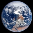
I was sure that someone would have made one of these, but alas, I couldn’t find one. Too bad. The closest thing I could come up with is the inflatable Astronaut View Globe from Jet Creations—available at Ultimate Globes. It is, as the name suggests, what the world looks like from space. Since there’s no printing on this globe, you could easily turn it south side up, which is actually the way NASA’s famous “Blue Marble” photo was originally taken (as shown here).
Maybe I’ll have to get somebody to make an upside-down custom-made globe for me. Maybe Mr. Bellerby, of Bellerby & Co. Globemakers, can give me a hand. (Update: see An Upside Down Globe: The Wait Is Over, Now the Waiting Begins)
(My favorite quotation from this video is “The whole way of making anything using a sphere as its base, as its centerpiece, is fraught with different problems and issues because you’re multiplying every error by pi.”)
All this has got me thinking: What else do we in the North and West take for granted? For instance, in my post Les Images de France 5, the creators of the TV idents describe their images this way: “Everything travels from left to right,” and “this is of course about moving forward.” Why is rightward movement usually associated with progress? Is this because we read from left to right? If so, then is it the same in cultures that read right to left, such as in Arabic-speaking countries? Or is progress, for them, a right-to-left thing?
It’s got me thinking.
Bonus Map #9: The Atlas of True Names
This set of maps, from German cartographers Stephan Hormes and Silke Pest, renames places with their original literal meaning. See my later post for a full description.
(Sanette Tanaka, “Study Points to Bias toward a City’s North Side,” The Wall Street Journal, July 4, 2013)
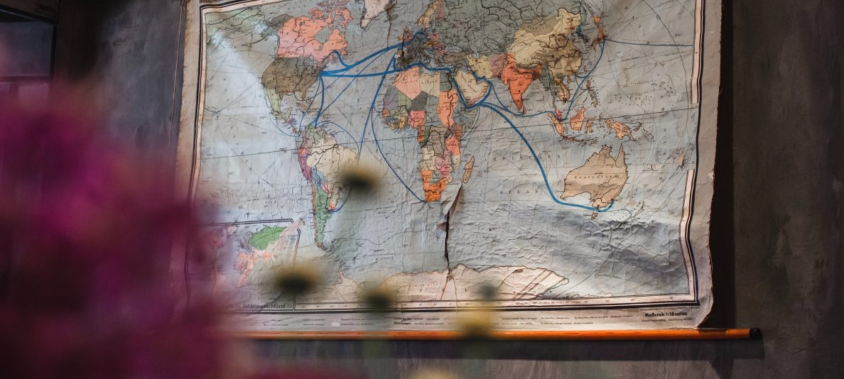
[photos: “World Grunge Map,” by Nicolas Raymond, used under a Creative Commons license; “The Blue Marble from Apollo 17, courtesy of NASA]